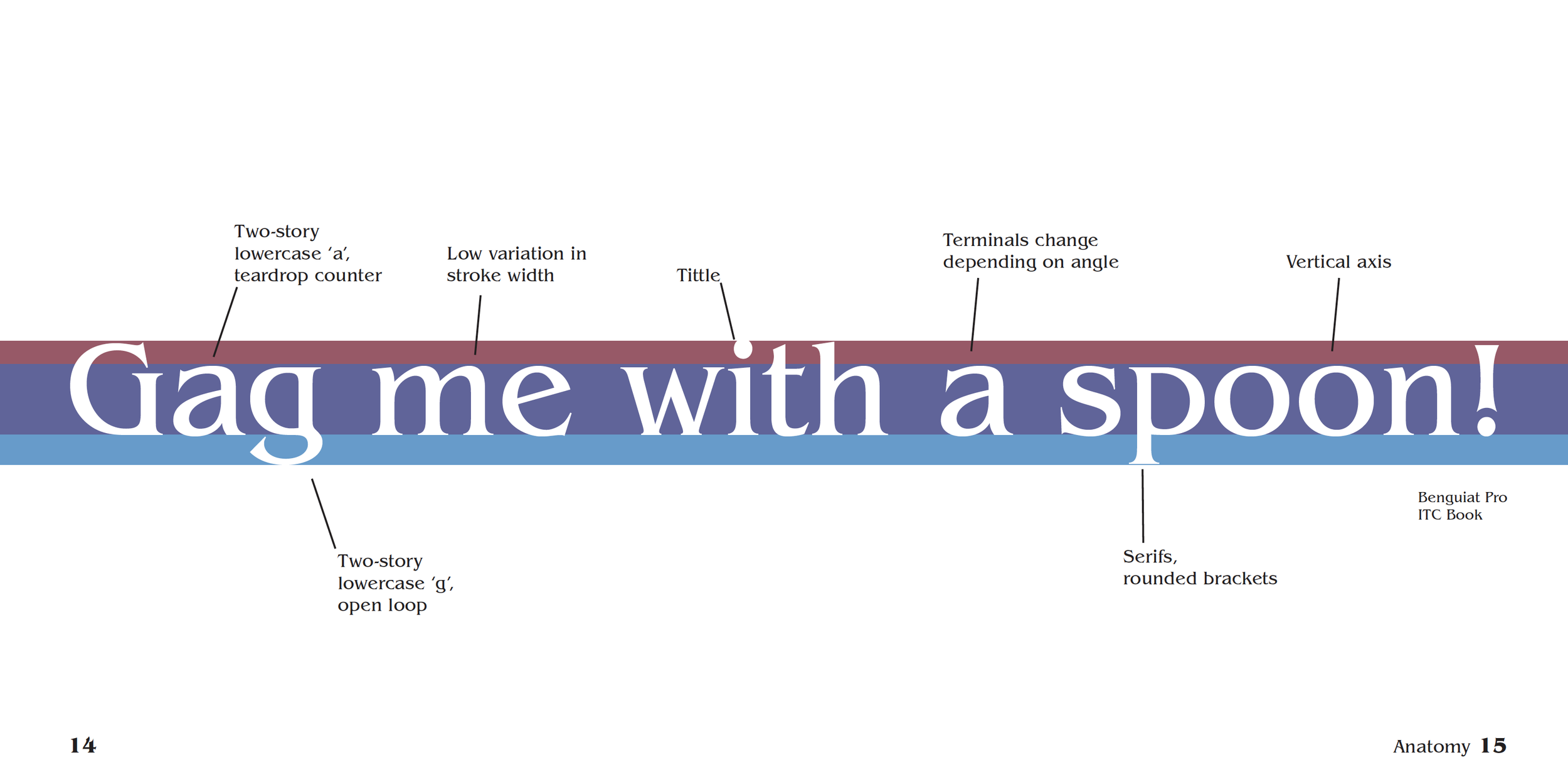
Benguiat Pro ITC Specimen
Recently repopularized through the hit Netflix original “Stranger Things”, Benguiat Pro ITC serves as the quintessential 80s typeface.
Roles: researcher, designer, copy writer, editor
Tools used: Adobe InDesign, Adobe Illustrator
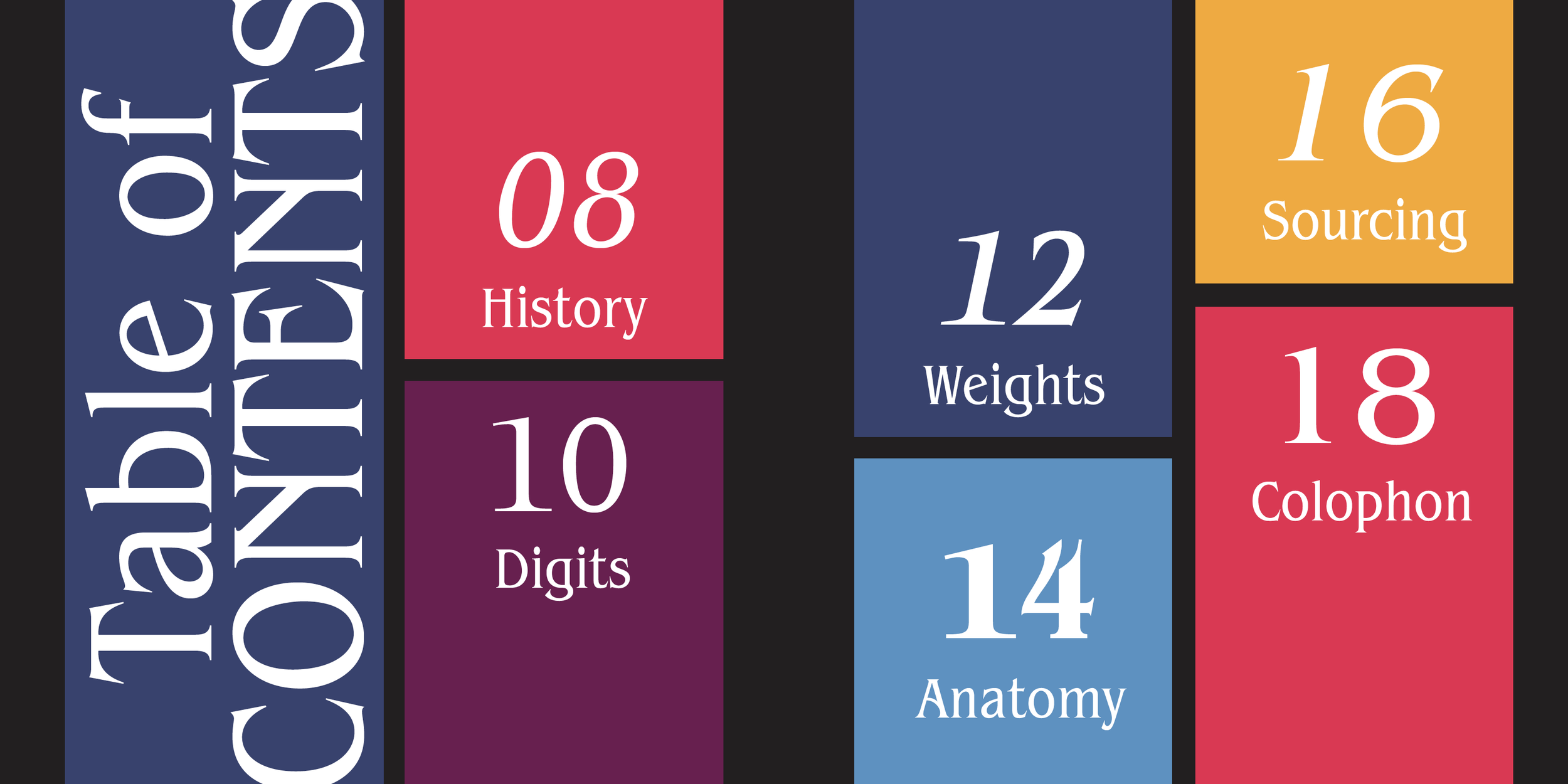
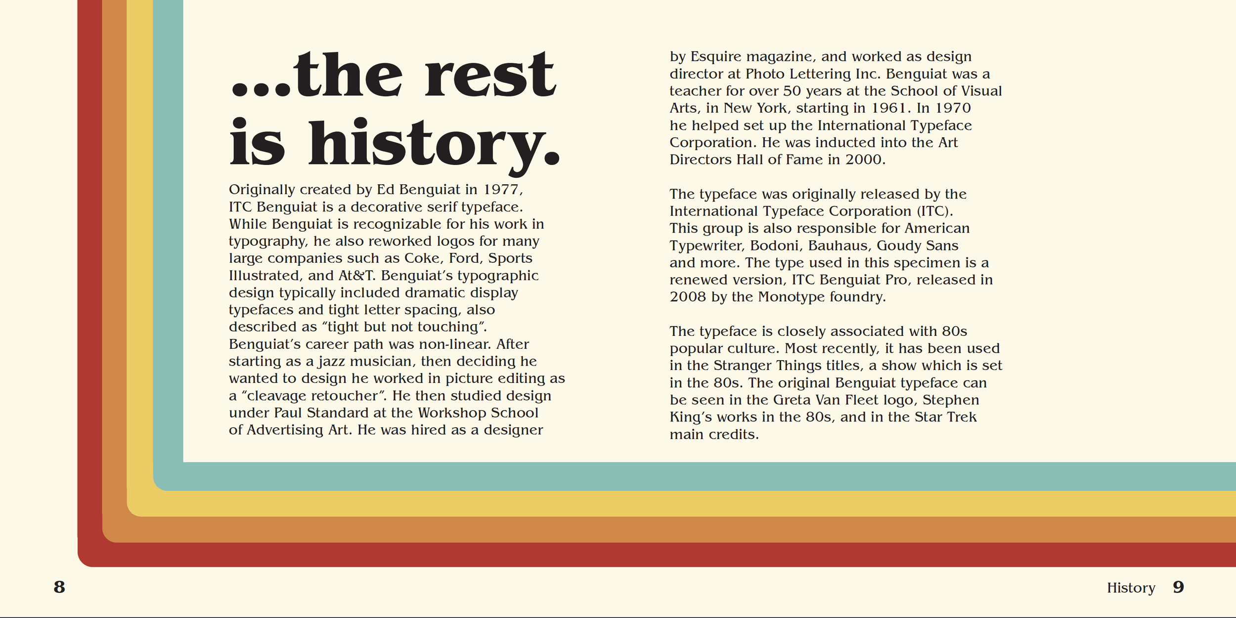
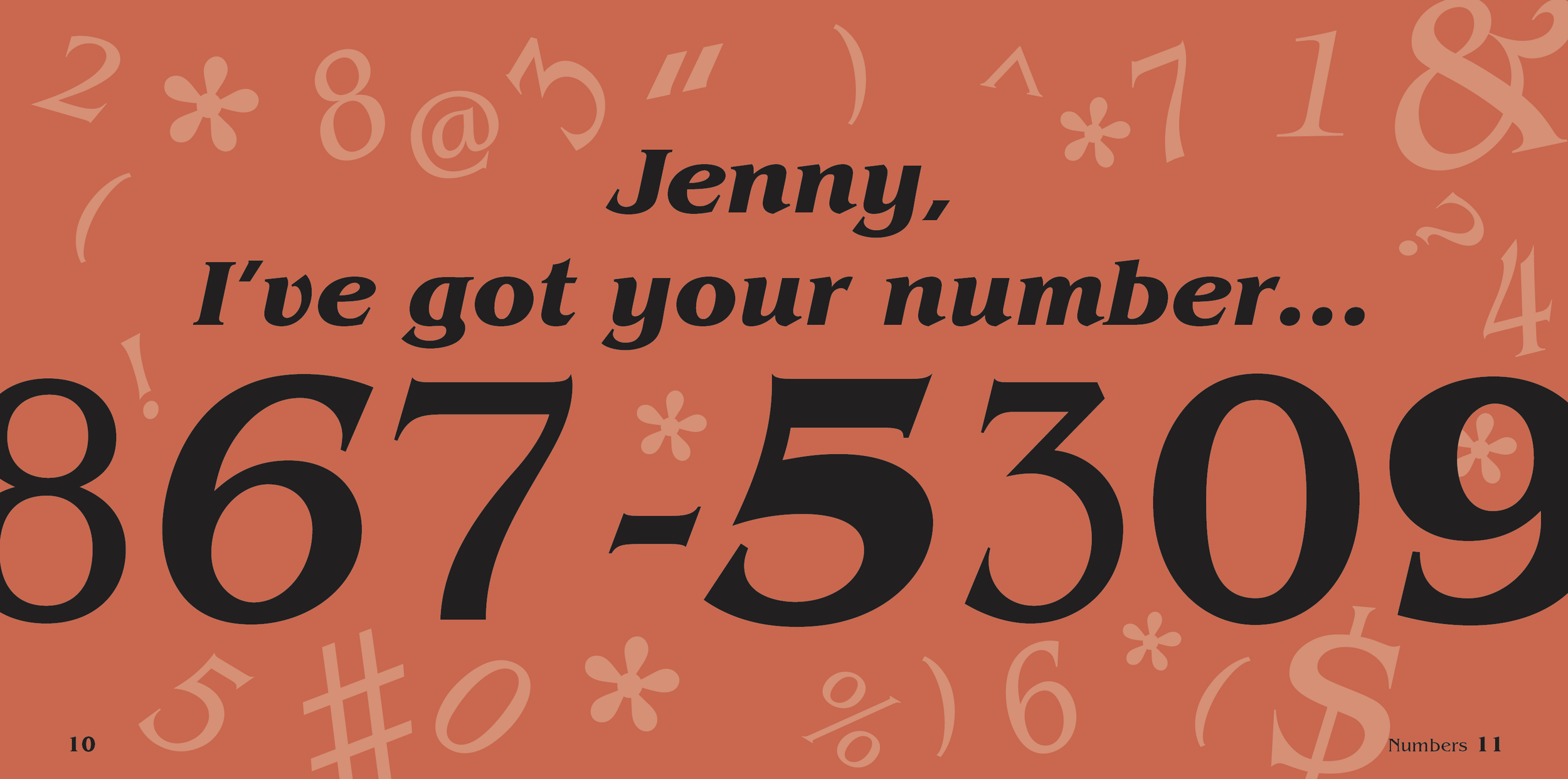
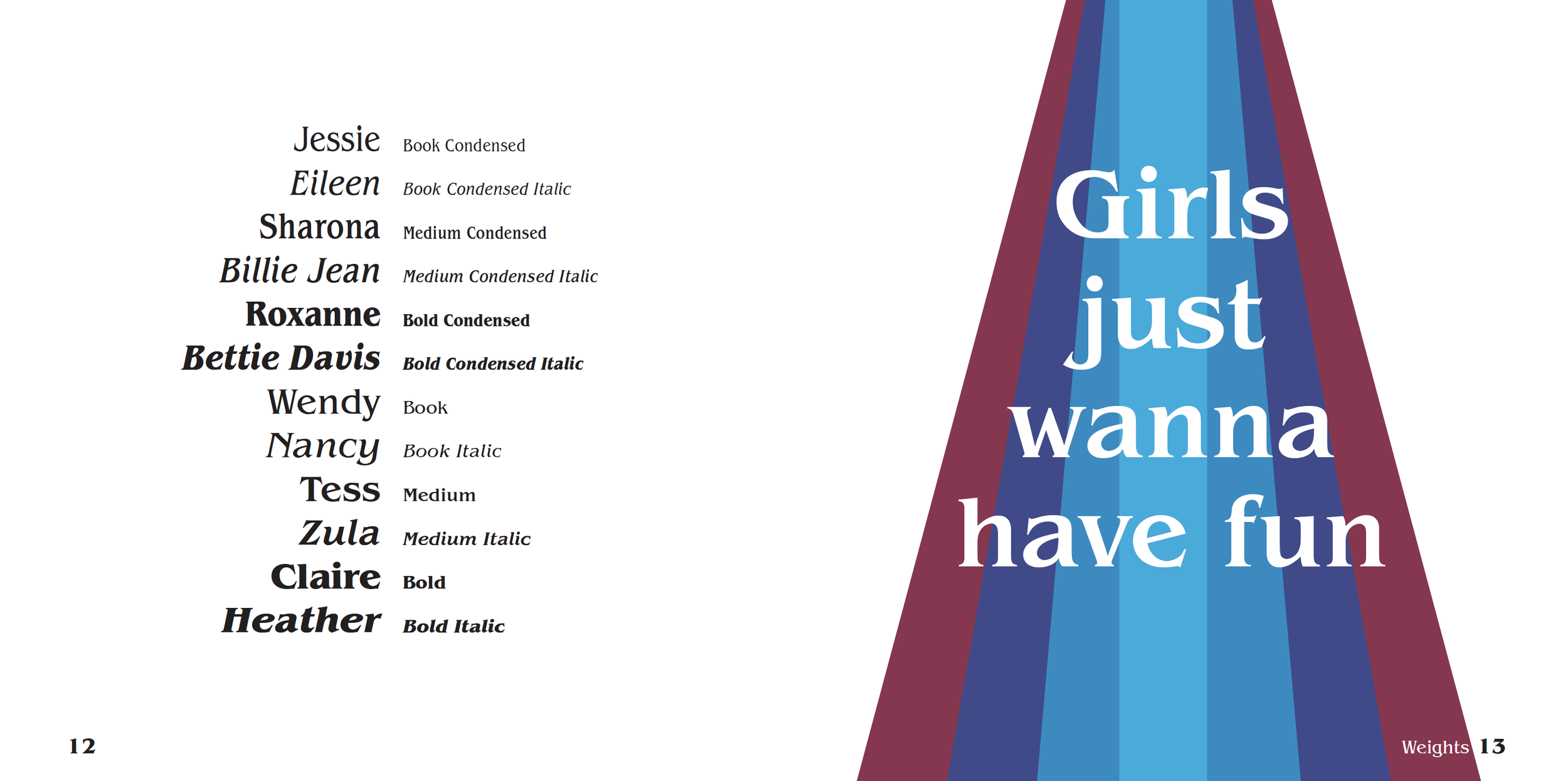
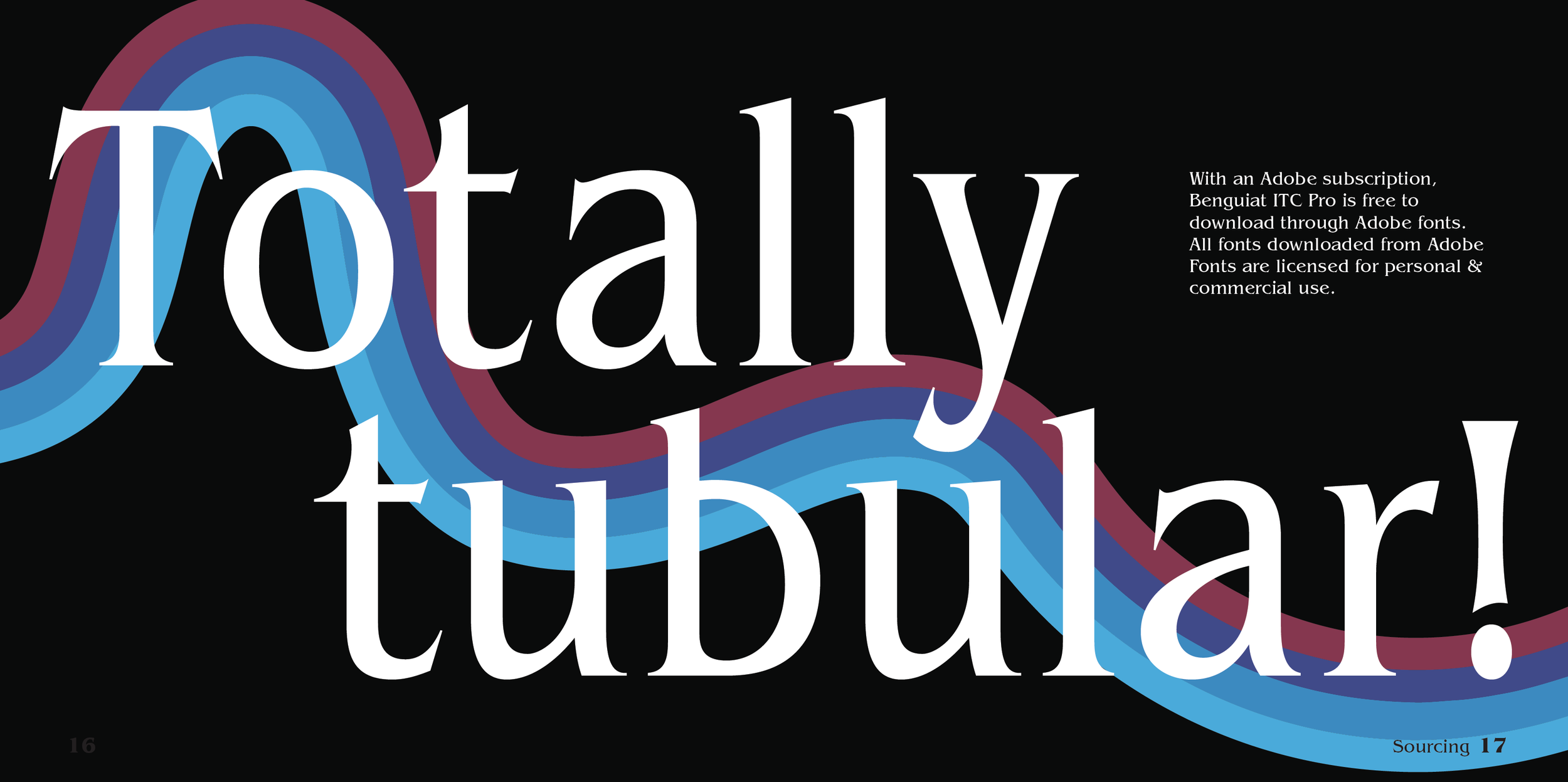
Both the visual and verbal concept for this project was an homage to the 80s. This typeface was originally used heavily in the 1980s and is now being brought into the present through its use of it on the Stranger Things TV show. The colored lines throughout the specimen and the actual colors used contribute to this vintage feel, while not being aggressively obvious about being decades old. I used a 6-column grid, mainly because my body copy was best readable in 3 or 4-column blocks. Since most of my copy was display copy, I tried to keep it within the grids, but it often was just centered on the page and/or was the width of the page (to the edge of the board OR to the margin). The baseline grid was set to 12 because the body copy was 10pt/12pt.
